Multi screen environment
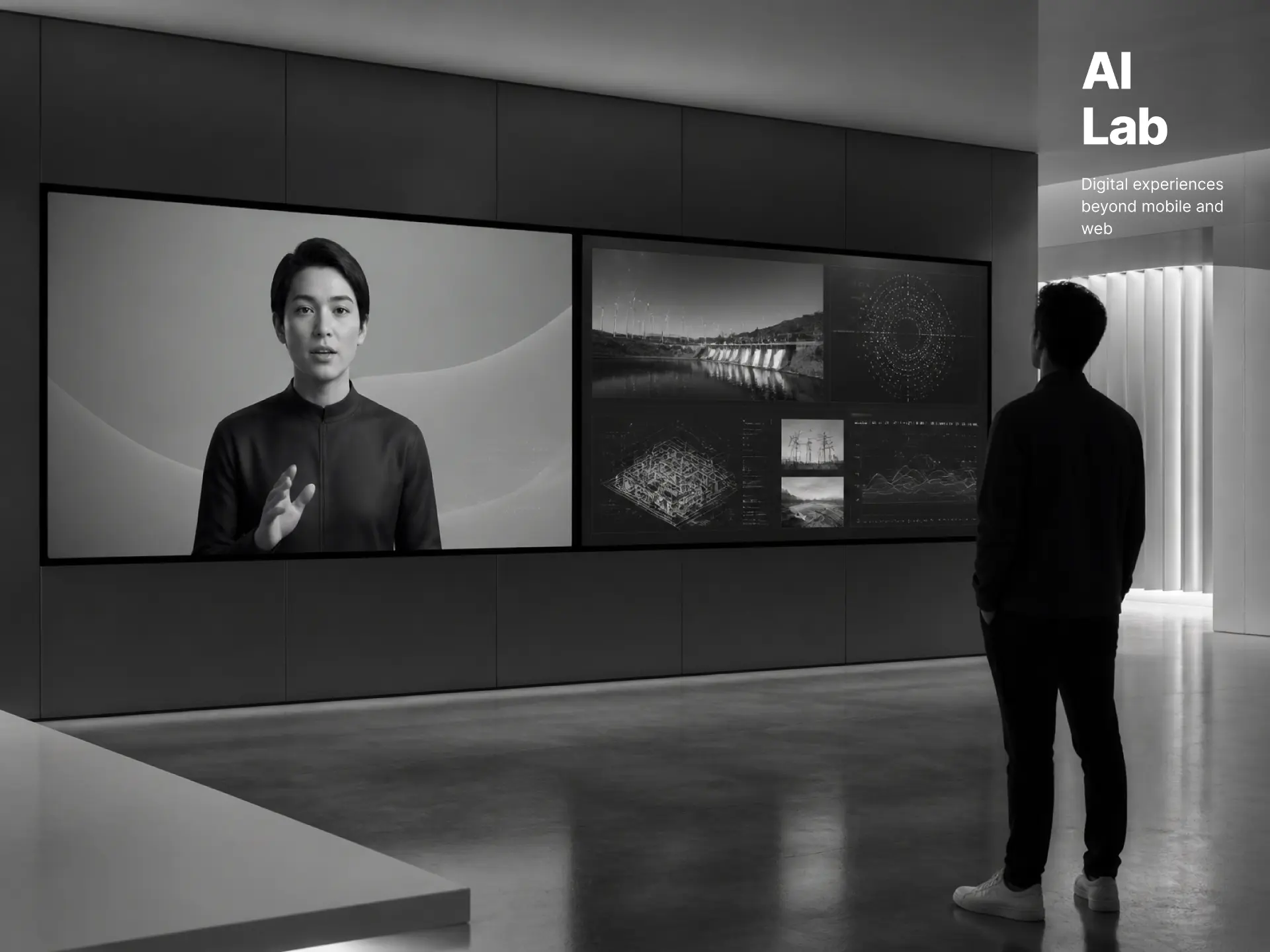
AI Lab: Digital experiences beyond mobile and web
- Client
- Global enterprise
- Industry
- Energy
- Role
- UX Designer
- Platform
- Dual 86-inch displays
Team
1 UX Designer · 3 Data Scientists · 4 Developers · 1 Client Partner · Client team
Overview
Not a regular UX project – Designing the unknown
Most UX projects start with a problem, a user group, and something to design. This one started with a lab.
The space had two large displays placed side by side. One was meant for a conversational avatar, while the other would show information based on what the avatar was talking about. Beyond that, a lot of things were still open.
There was no fixed feature list or user journey. We were exploring ideas like personalised greetings, facial recognition, safety checks and PPE detection.
So before getting into the UI, I had to help figure out what the experience could actually look like. I started putting the early ideas into simple scenarios, assumptions and flows so the team and client could see them, discuss them and decide what was worth taking forward.
The challenge
Turning an open-ended idea into something real
The idea kept changing as we explored the possibilities. New possibilities came up in conversations, but there wasn’t enough time to design and build every one of them.
There was also a fixed deadline. The experience had to be ready for an important leadership visit.
The challenge was to explore enough without getting stuck designing things that might eventually be dropped.
So instead of spending too much time on polished screens early on, I focused on getting ideas out quickly and making them easy to get feedback on.
An adaptive framework
01
Define the scope
Get clear on what we’re building
02
Prioritise requirements
Focus on what’s needed for the leadership visit
03
Understand the users
Consider the visitor types and what they need from the experience
04
Map the experience
Map out key journeys and interactions
05
Design & iterate
Build demo prototypes to gather feedback and refine
Early exploration
Starting with ideas, not screens
Before moving into detailed design, I mapped out the different directions we could take.
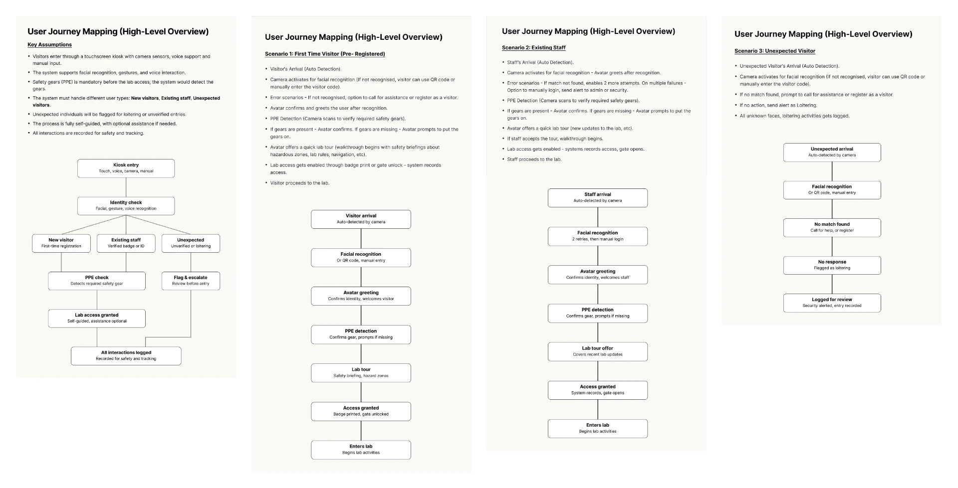
First time visitor
Unknown to the system, guided through onboarding, safety instructions, and lab readiness.
Returning staff
Recognised on entry via facial recognition; the avatar greets them by name and picks up where they left off.
Unverified visitor
No match, no consent, the system flags the visit and keeps the record.
Finding a direction
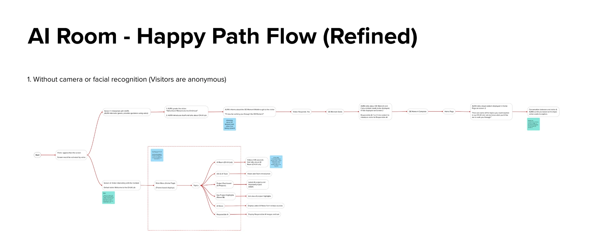
From possibilities to a happy path
Once we had explored the different directions, we started narrowing things down based on what needed to work for the leadership visit.
We decided to keep the first version simple: a visitor, an avatar leading the interaction, and the second screen supporting the conversation.
Ideas like facial recognition, PPE detection and personalisation were kept aside for later rather than trying to fit everything into the first version.
In scope
- Visitor Entry Flow
- Avatar Interaction
- Happy Path Flow
Parked for later
- Facial Recognition
- Camera based PPE detection
- Personalisation & advanced tracking
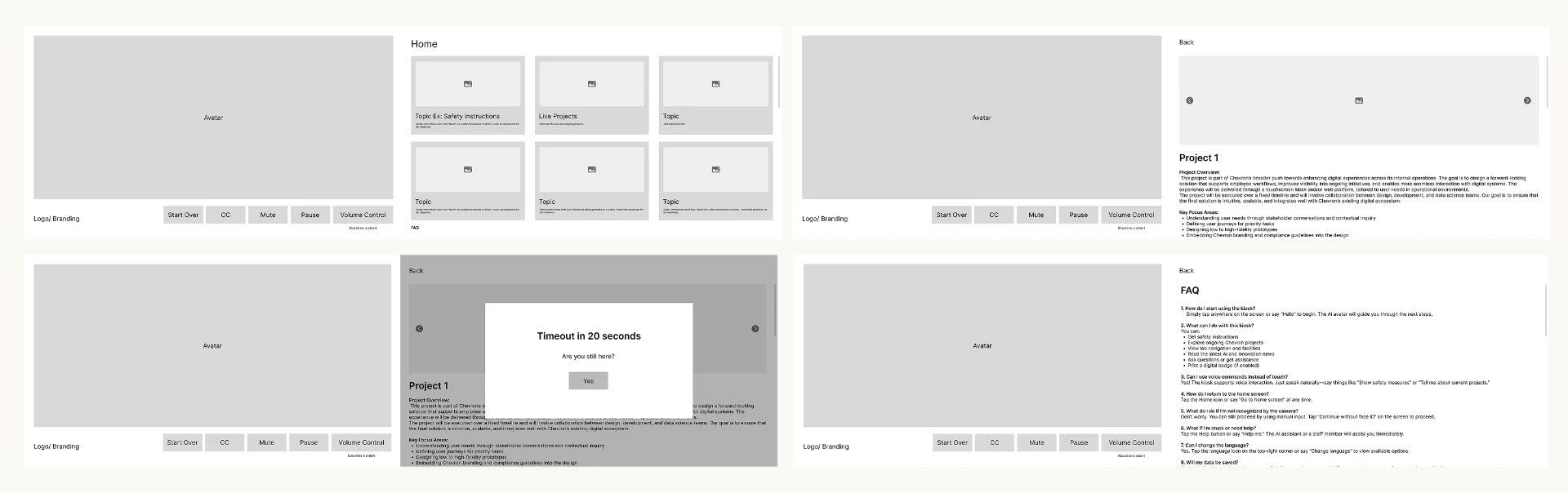
Bringing the idea to life
The two displays were designed to work together rather than behave like two separate screens.
The first screen focused on the avatar and the conversation. The second screen showed information related to whatever was being discussed.
The idea was simple: one screen talks, the other shows.
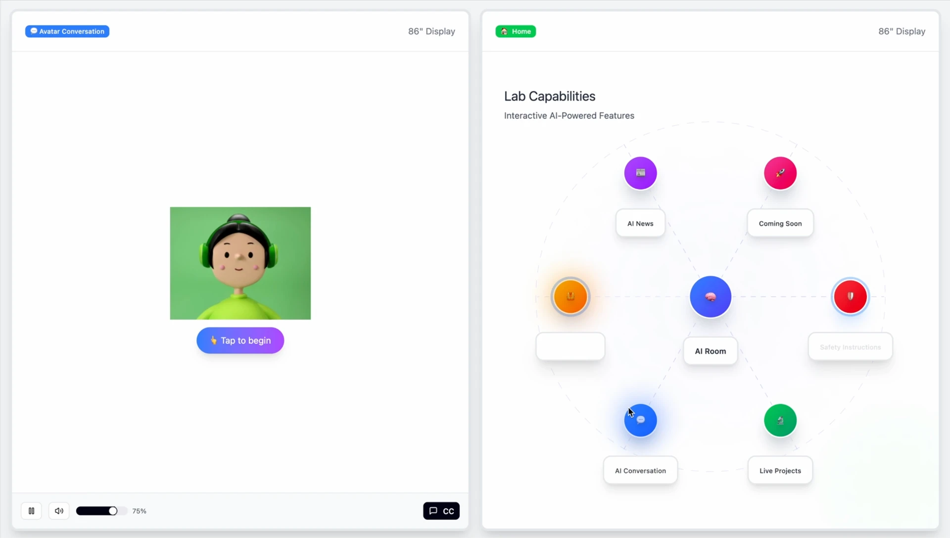
Initial demo
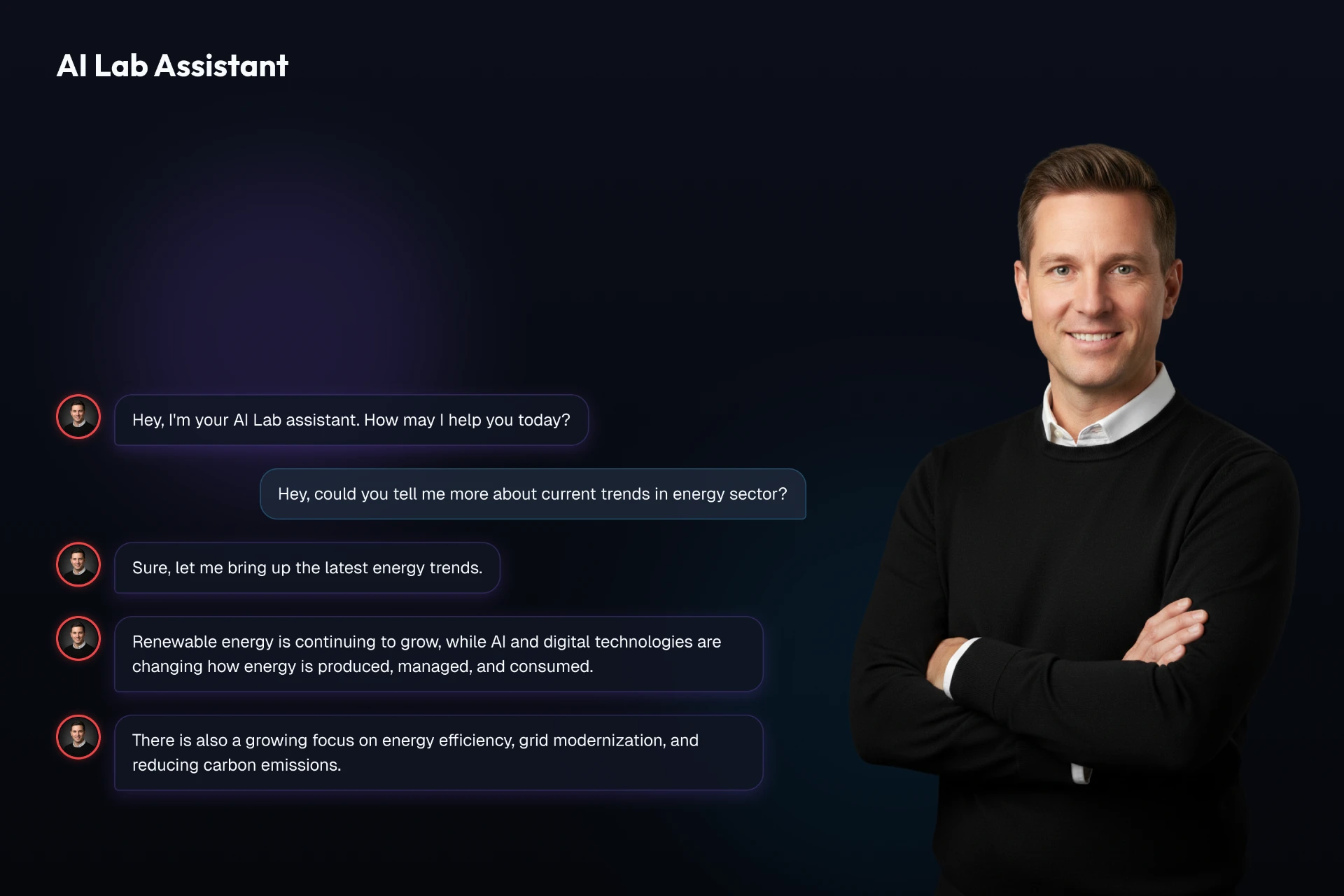
I used Figma Make to turn the flow into a simple working demo. This helped us see the idea in action and made it much easier to discuss what was working and what needed to change.
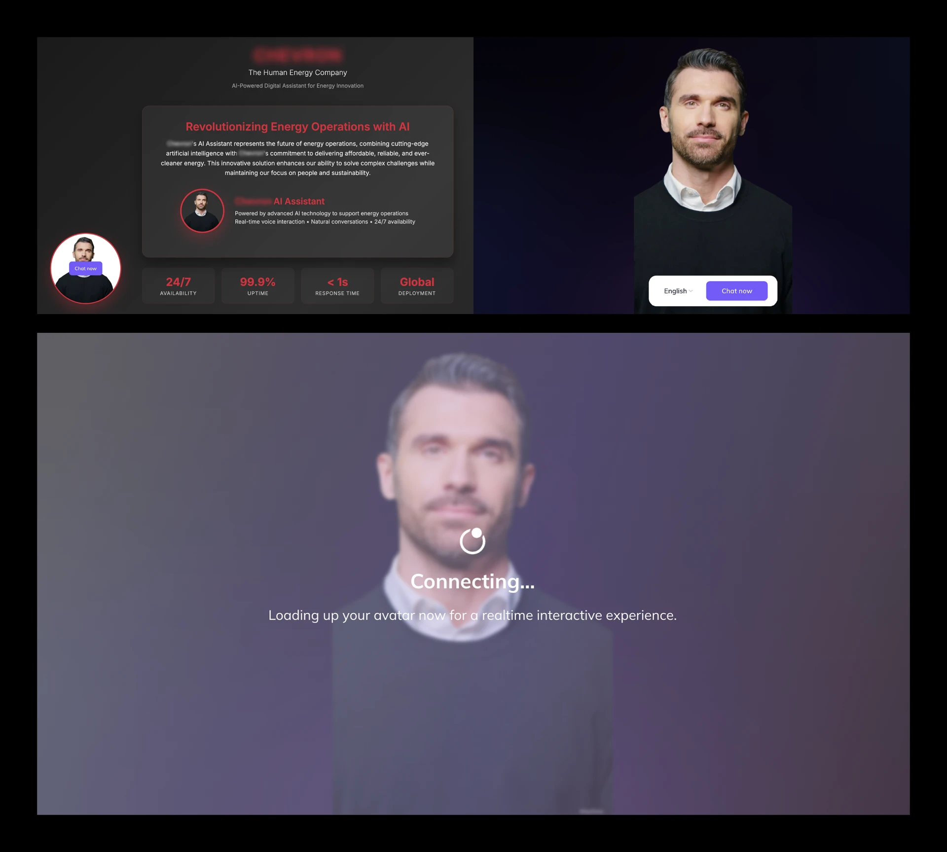
From prototype to working demo
Once the direction was clear, I took the prototype further to show how the avatar and conversation could work. I worked on setting up the avatar and connecting its responses to the different topics in the flow. The working demo made it easier to show how the conversation would unfold, rather than explaining it only through flows and screens.
From designing to directing
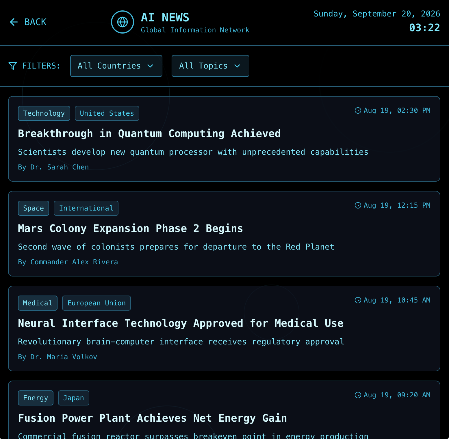
As we explored the experience for the two large displays, we also explored different visual directions for how the interface could look and feel in the space.
The client wanted to see a few different directions, including a J.A.R.V.I.S style interface, a futuristic direction and a solar-system-inspired look.
With a tight deadline, creating a separate design system or UI kit for every direction wasn’t practical. Instead, I used prompts in Figma Make and other AI tools to explore different visual ideas and then refined the ones that worked best.
This also gave the developers a starting point to build from.
Exploring what could come next
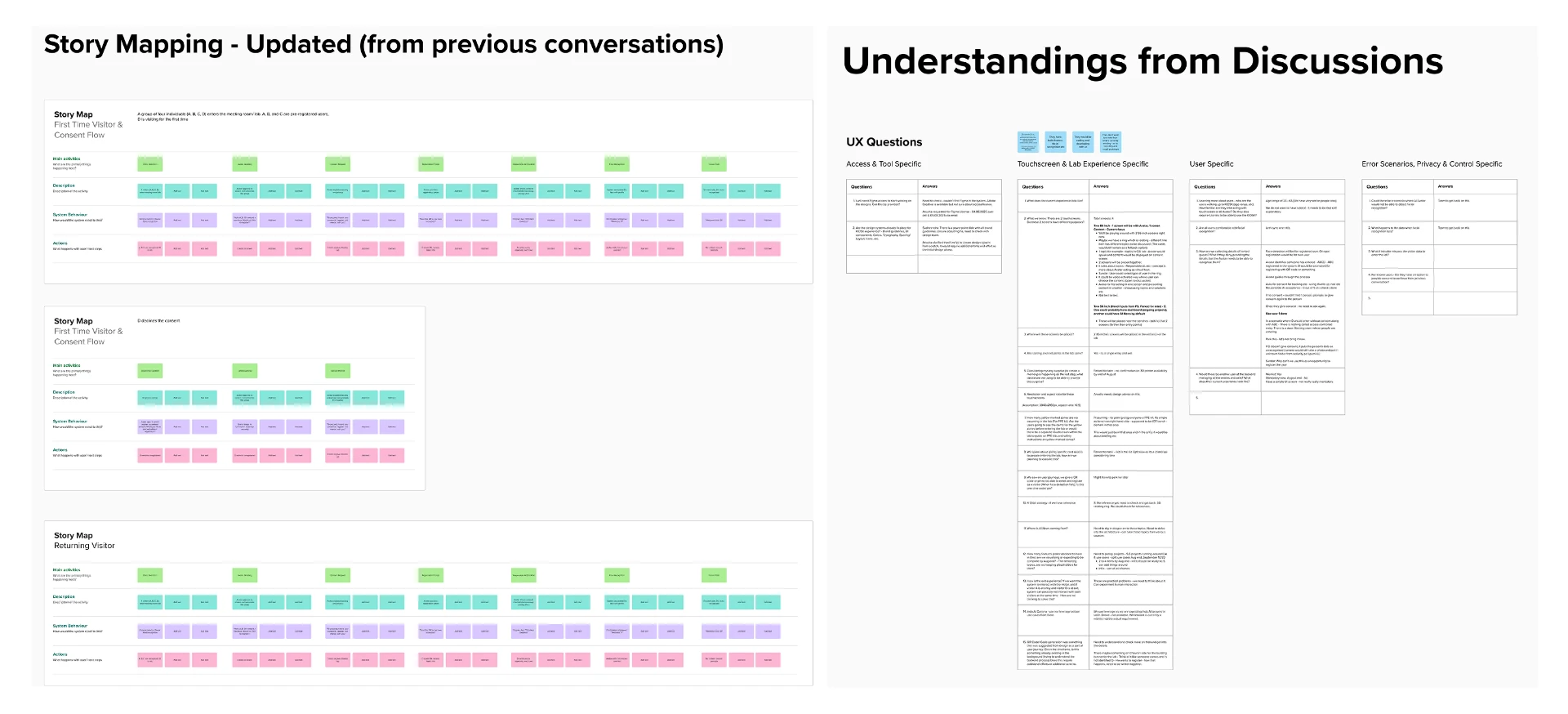
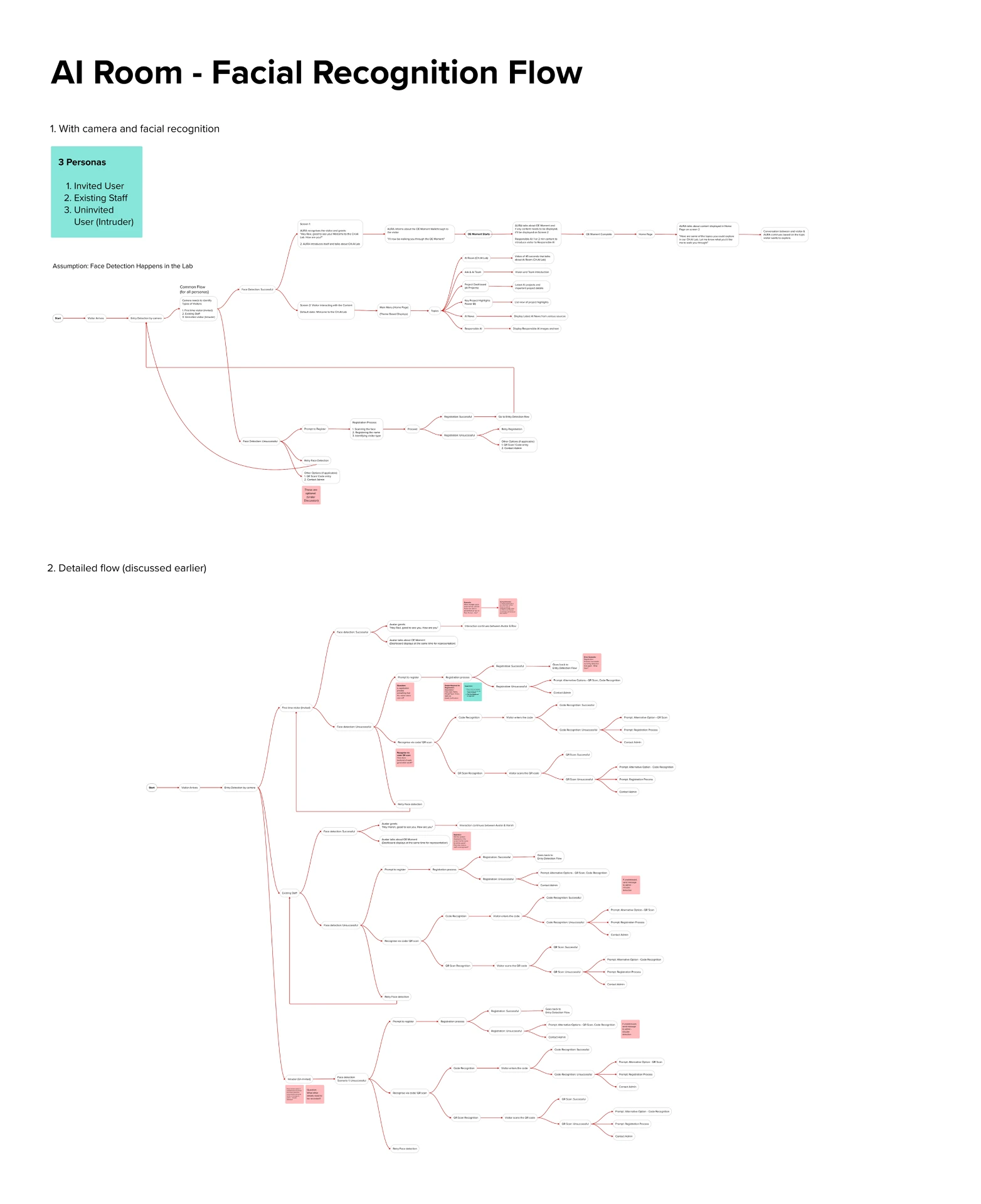
As the concept evolved, I also explored a few additional user flows and ideas for possible later scopes.
What I took away
Designing when the brief isn’t clear
This project taught me that the first part of UX is figuring out what you’re actually designing. The brief was still changing, so quick flows and working demos helped us explore ideas without spending too much time on something that might change later. I also got to work with tools I hadn’t used before, including Figma Make and AI avatar platforms. It was interesting to see how these tools could help turn an idea into something people could actually experience. Most importantly, the project made me think beyond individual screens. The avatar, conversation, content, two displays and the physical space all had to work together for the experience to make sense.
From designing the unknown to making it work