Mobile App & Admin Portal
Walkfin: Streamlining loan applications with a user-centric fintech app
- Client
- Walkfin
- Industry
- Fintech
- Role
- UX UI Designer
- Platform
- Mobile & Web
Overview
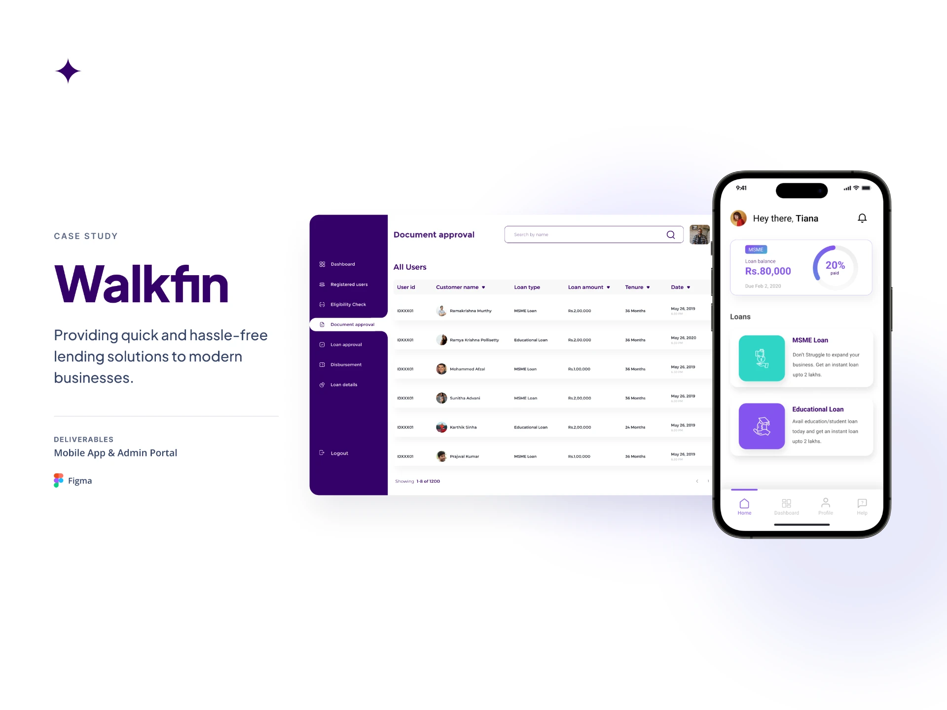
Walkfin is a digital lending platform designed to make applying for a loan simpler for students and entrepreneurs.
The mobile app lets users explore loan options, apply for a loan by submitting their details and documents, and keep track of their application without having to visit a bank. Alongside the app, we also designed an admin portal to help the team manage applications and support the process from the other side. The goal was to make the experience clearer for both the person applying for the loan and the team processing it.
The problem
Applying for a loan involved a lot of back and forth.
Traditional loan applications could involve multiple bank visits, paperwork, and uncertainty around what happens after an application is submitted.
For students and entrepreneurs, understanding eligibility, requirements, documents, and application status could make the process even harder. On the other side, the team processing applications also needed a structured way to review information and manage documents. The challenge was to bring both sides of this process into a digital experience without making an already complex journey harder to understand.
What we focused on
01
Clearer
Help users understand available loans, application requirements, and next steps.
02
Easier to complete
Break down the application into manageable steps and reduce unnecessary effort.
03
More transparent
Help users understand where their application stands and what to expect next.
04
Easier to manage
Give the internal team the information and structure needed to process applications.
Understanding the loan journey
We started by trying to understand how students and entrepreneurs approach the loan application process.
We looked at what information they need before applying, what they need to provide during the application, and where the process could become confusing or time-consuming.
- • Users needed to understand the loan before starting an application.
- • Requirements and documents needed to be clear upfront.
- • A long application could feel overwhelming.
- • After applying, users needed to know what was happening with their application.
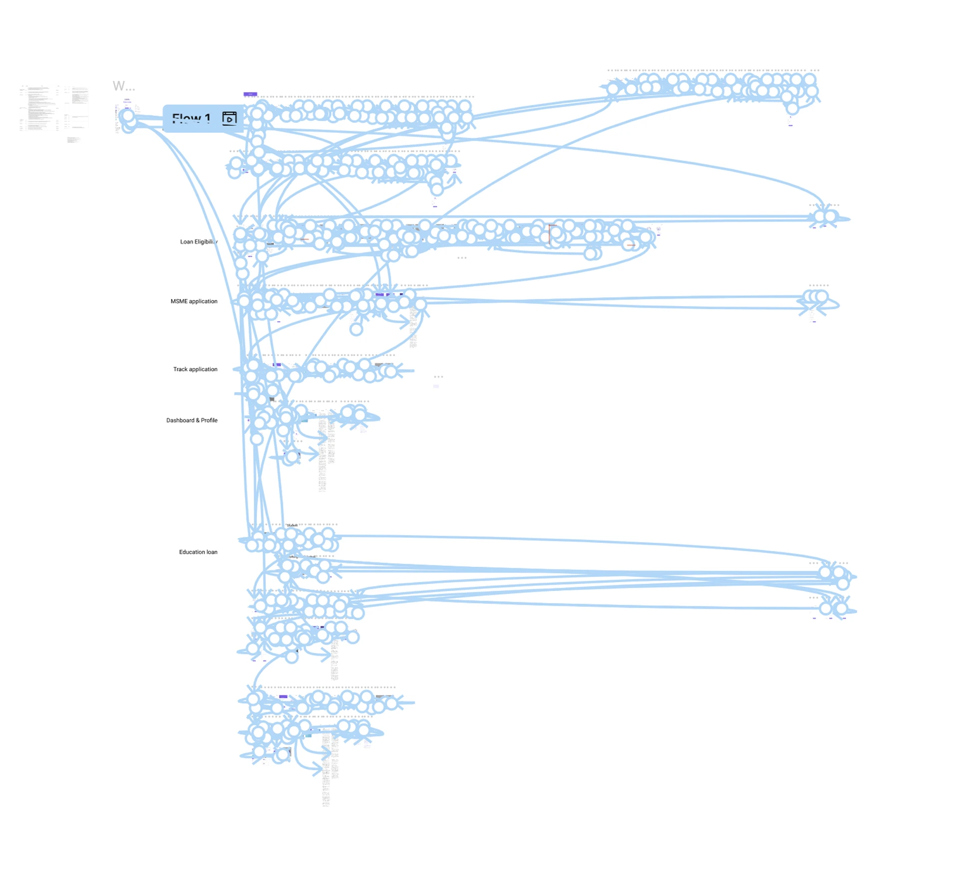
Mapping the flow
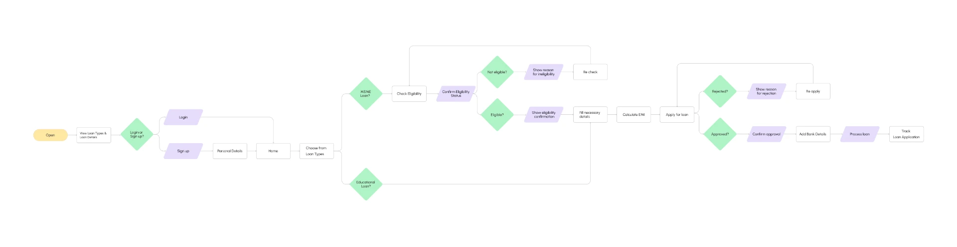
We mapped the journey from exploring a loan to completing the application and checking its status. This helped us work out what information was needed at each stage and where we could simplify the flow.
Starting with wireframes
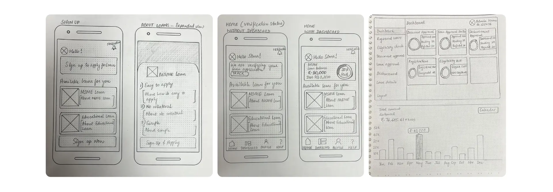
We started with low-fidelity wireframes to figure out the structure before getting into the visual design. At this stage, we worked through the main screens and interactions to see how the application could be broken down into smaller steps.
Designing the mobile experience
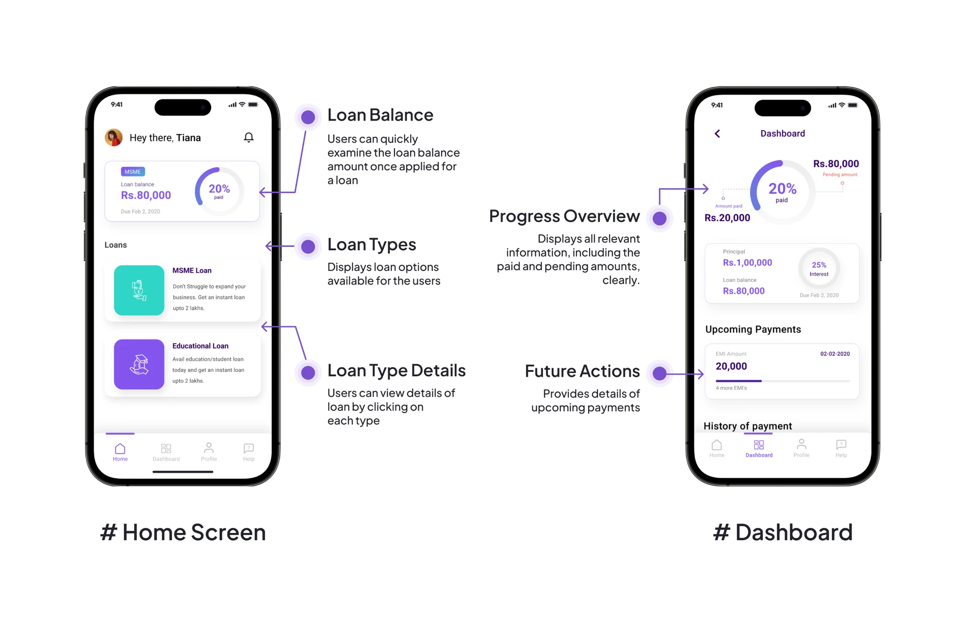
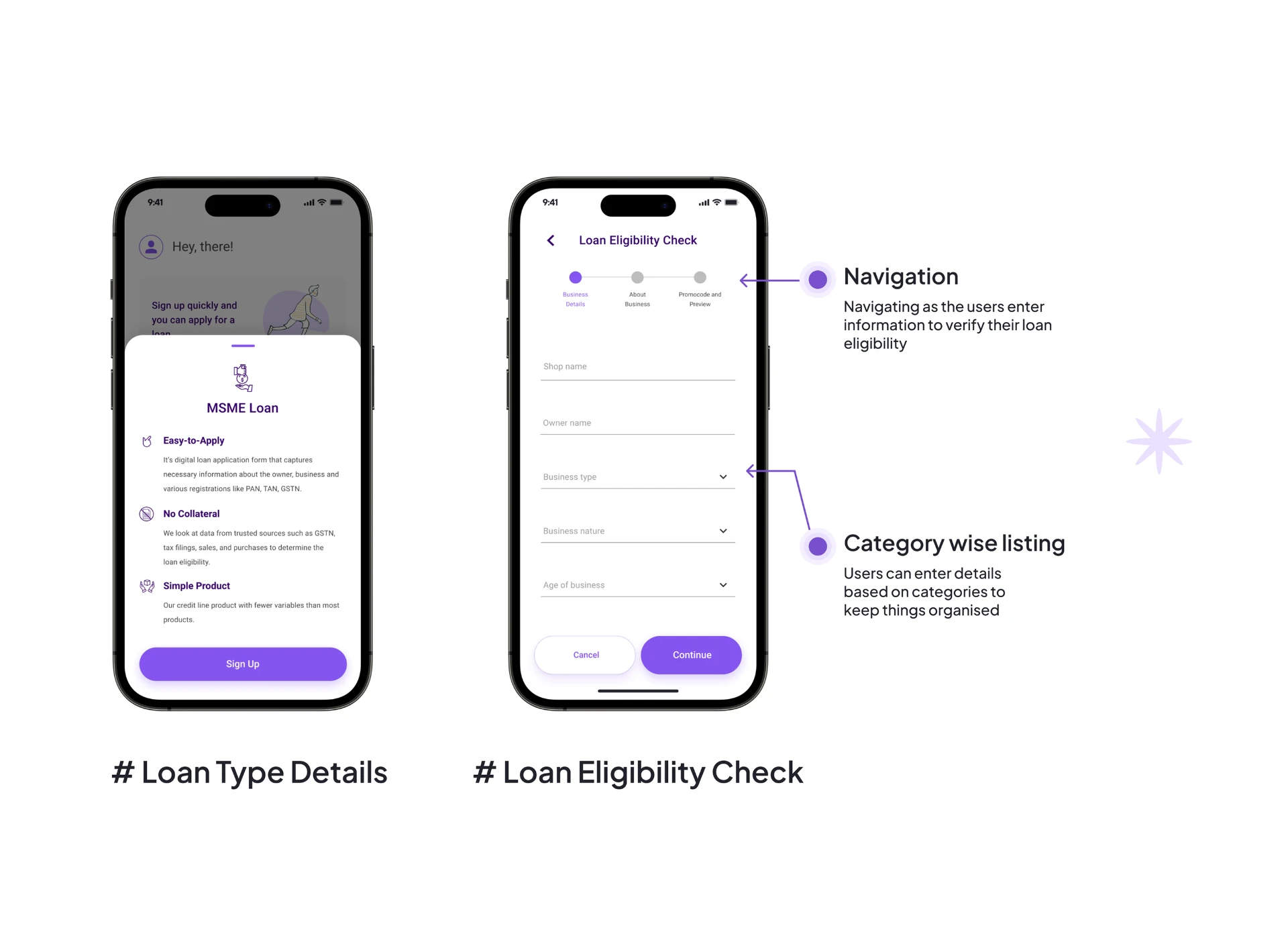
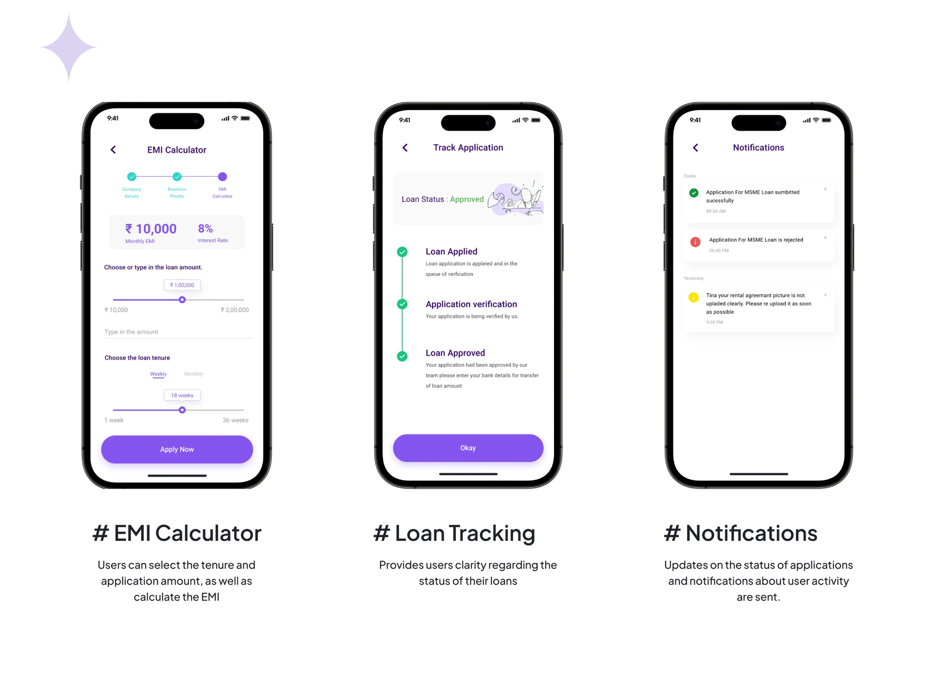
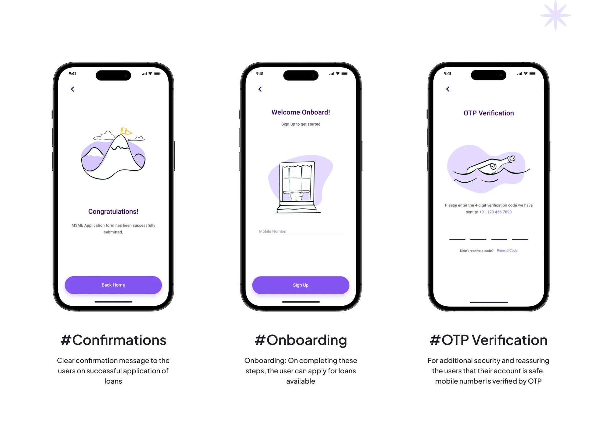
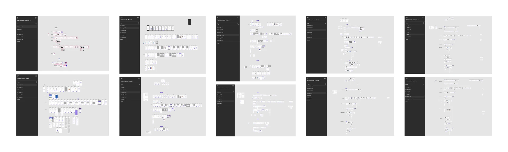
Testing and iterations
The first version wasn’t the final version.
We tested the prototypes and used the feedback to make changes to the flows and screens. Some changes were small, while others meant revisiting how information was structured or how users moved through a particular step.
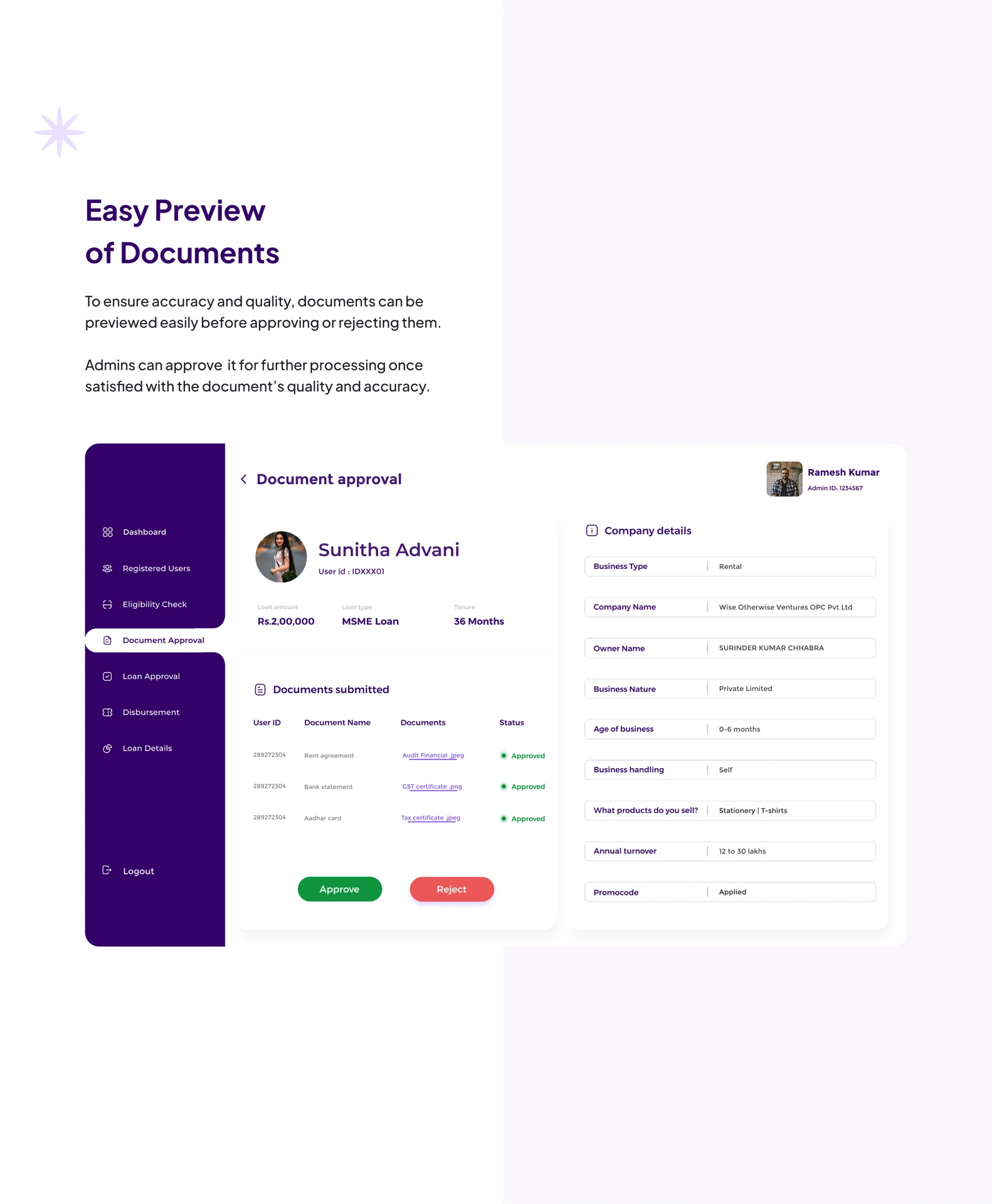
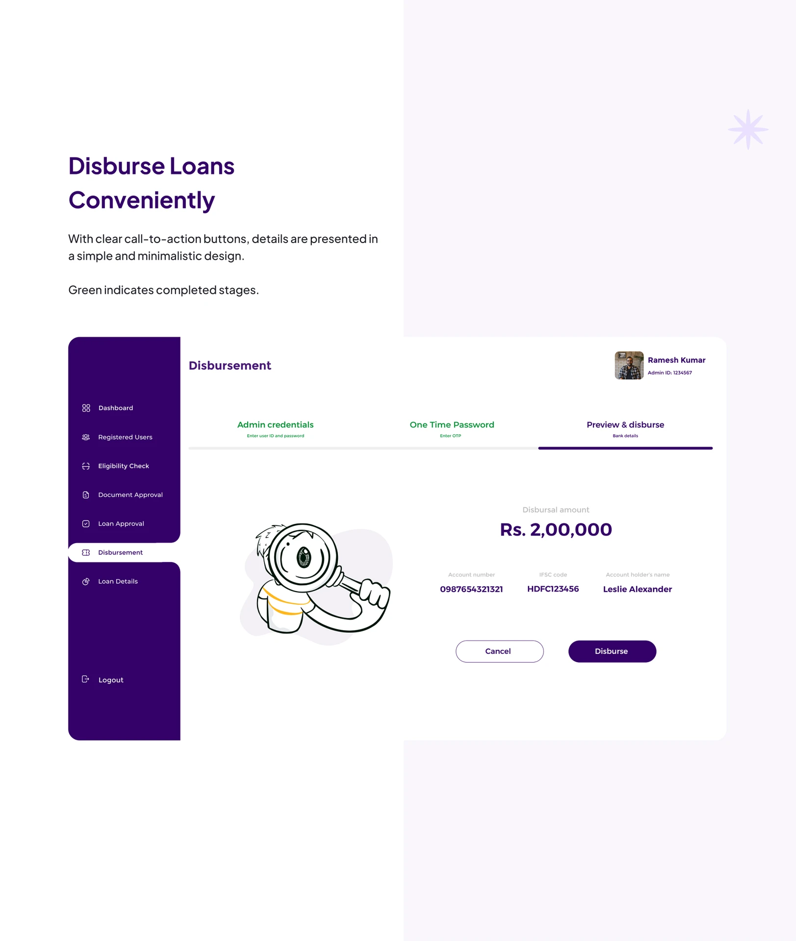
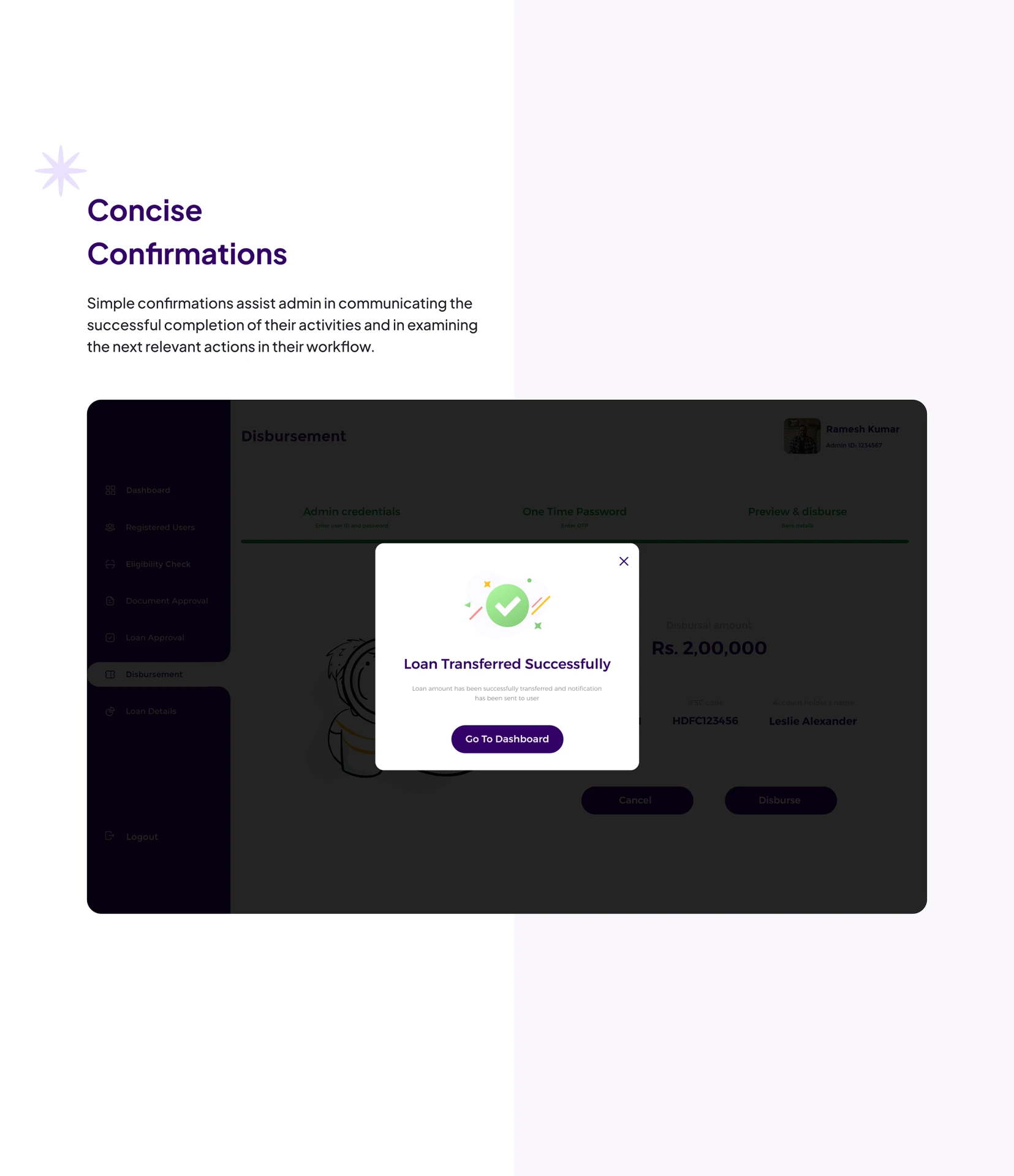
The admin side
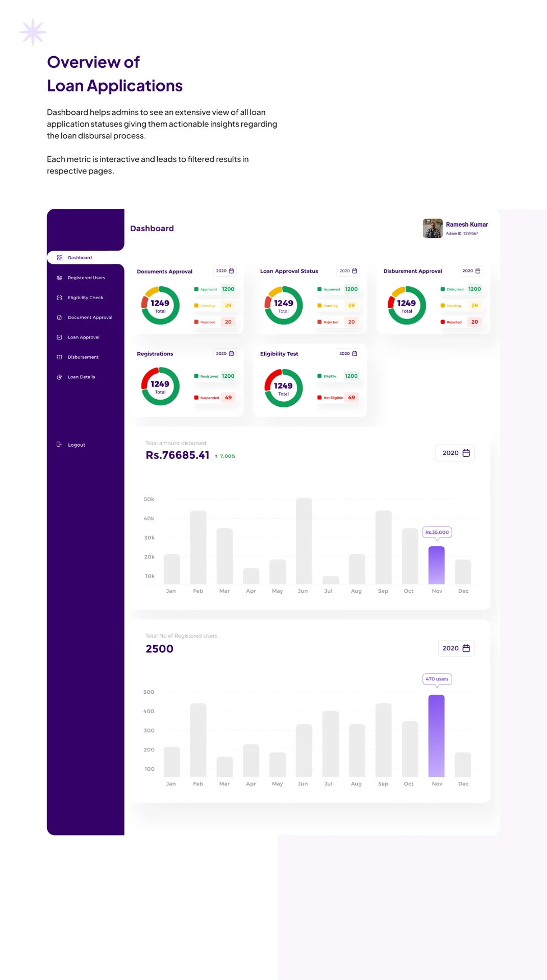
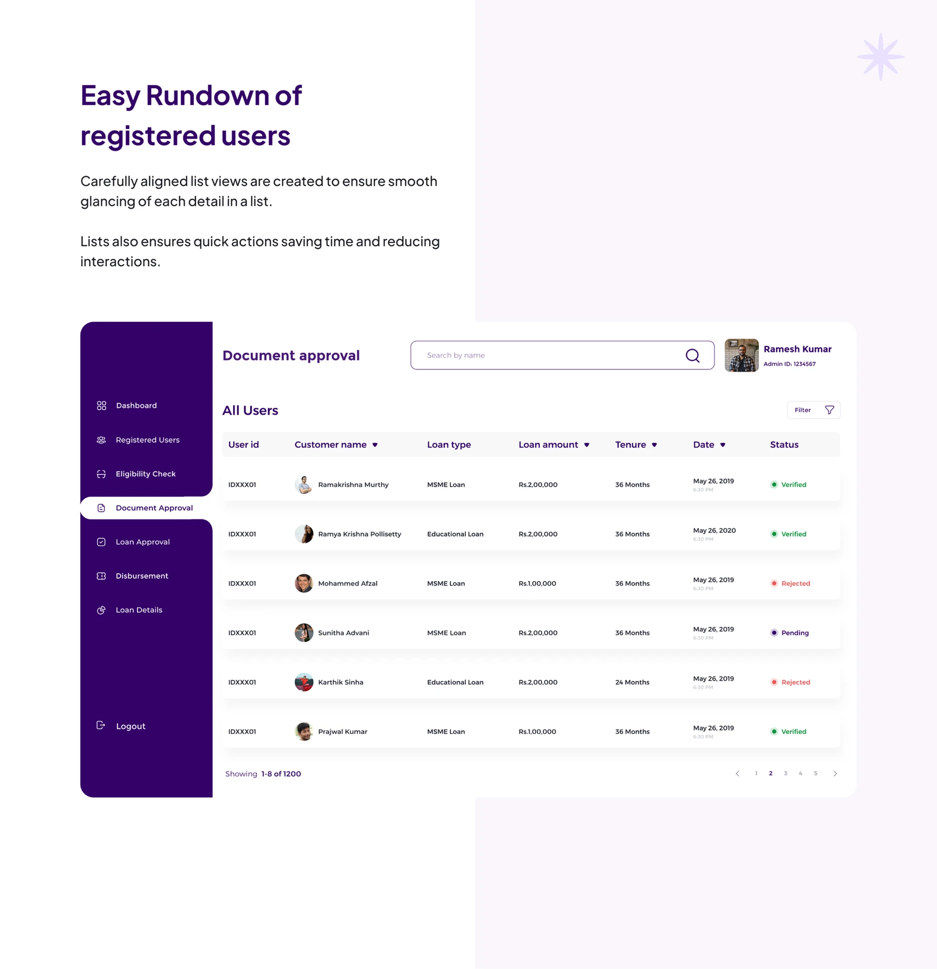
Walkfin also included an admin portal for the team handling applications.
The admin portal gave the team a place to review applications, check submitted information and documents, and manage their progress.
Challenges
Making a loan application feel less overwhelming
There was a lot of information to collect, but putting everything on one screen wouldn’t make the process easier. We broke the application into smaller steps and kept each screen focused on what the user needed to do.
Giving users enough information
Users needed to understand loan details, requirements, and documents before committing to the application. We focused on showing this information at the points where it was most useful.
Keeping users informed after applying
Submitting an application can leave users wondering what happens next. Application status and progress information gave users a way to check what was happening after submission.
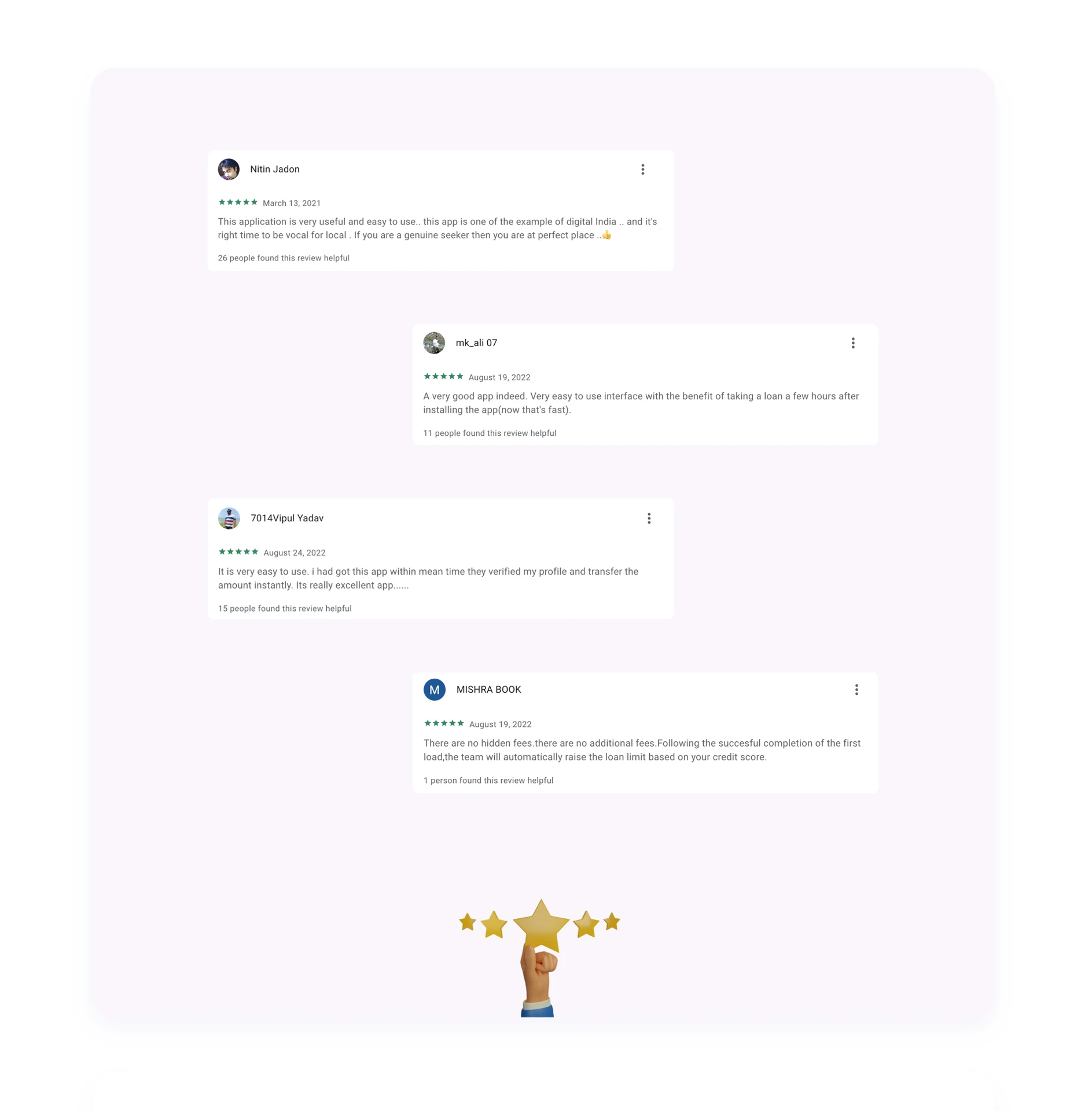
What users are saying
Want to try it yourself? Download the Walkfin app: Walkfin
What I took away
The biggest thing I took away from Walkfin was learning how to deal with a lot of information without making the experience feel complicated.
Financial products come with a lot of details, but users don’t always need to see all of them at once. A big part of the design was figuring out what information mattered at each step and keeping the rest out of the way.
It taught me that simplifying a product isn’t always about removing information. It’s about knowing what to show, when to show it, and how to make it easy to understand.